
Label Design Trends 2024
It’s always exciting at the beginning of a new year to predict what label and graphic design trends will be on the rise in the coming months. Over the last two decades, as design has become more and more digitized, stylistic movements and design trends change at a faster pace than ever; every year presents a new opportunity for brands to make changes and adjustments to their labels and packaging that will speak to the consumers of the day.
This year we expect to see some brands continue with bolder designs we saw last year in typography, colors, and illustrations, while many others will present themselves in a more natural and sustainable or vintage way.
Sustainable & Natural
“Sustainable” hasn’t always been a word that would be associated with label design, but as consumers demand sustainable packaging with greater urgency, producers are being required to respond. We offer a wide variety of sustainable label materials, including papers with different percentages of PCW (post-consumer waste). Our 100% PCW paper option is unbleached and has a Kraft paper look that directly broadcasts its recycled origin. You can learn more about our vast selection of sustainable options here. Whichever sustainable material option you choose, make sure to include information about that choice right on the label so you can cash in on consumer goodwill toward sustainable packaging choices.
Using sustainable materials for your labels and packaging is not the only way to subscribe to sustainable label choices, however. Using a QR code on your label that links to additional ingredient, use, and other pertinent information is a great way to eliminate extra printed material like outer containers and leaflets. What’s more, since your label design is all about communicating what kind of brand you are, opting for a design that broadcasts “natural” is a must for many brands. Neutral colors, greens, nature iconography,
and minimalistic design are all ways brands can make their brand appear more “natural” to potential buyers.
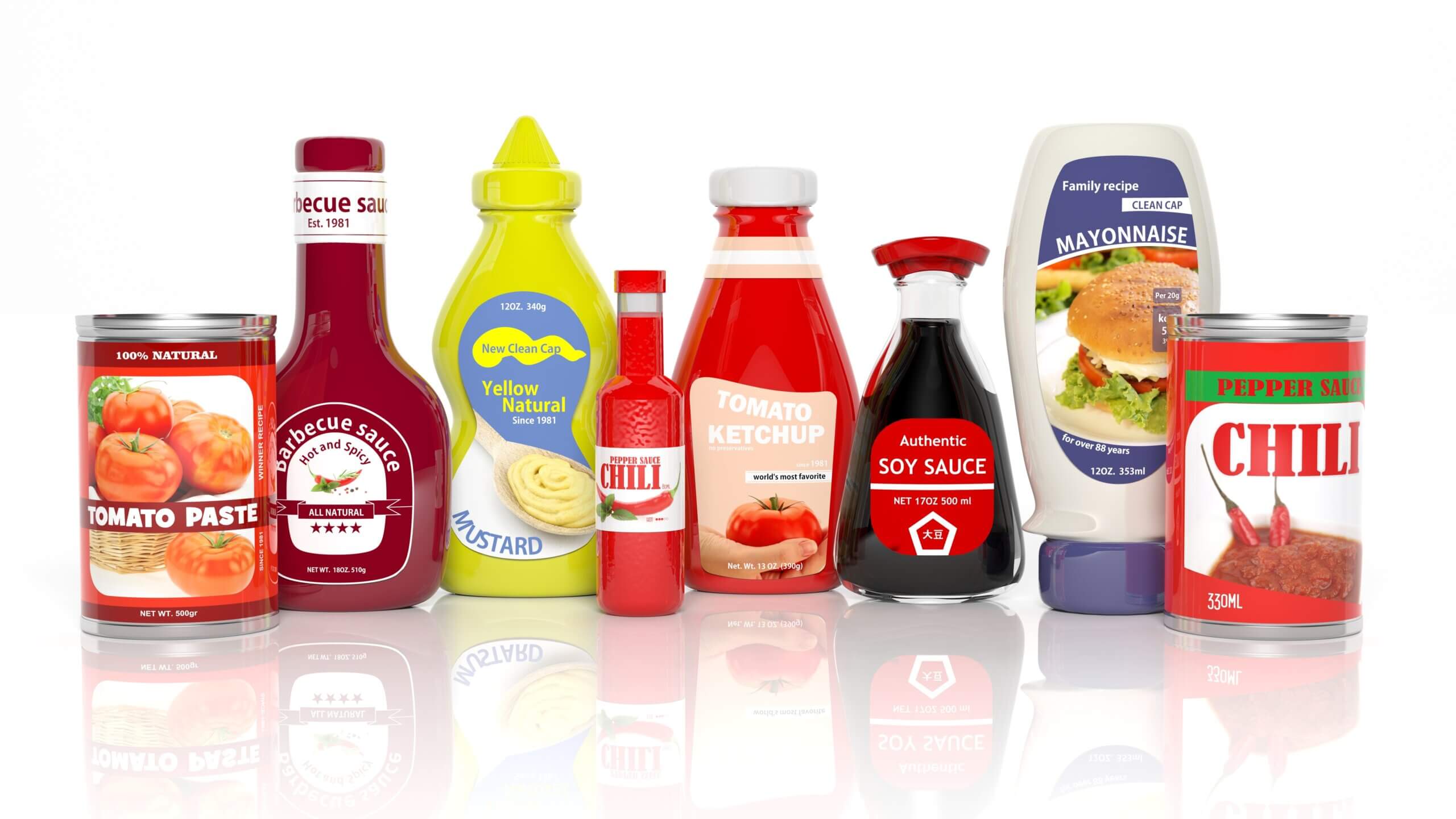
Bold Typography
As competition in most markets in as fierce as ever in 2024, setting yourself apart may mean creating label elements that are unique to your brand. Perhaps bright and busy backgrounds aren’t right for you, but you can capitalize on the trend toward bold packaging by using typography that stands out. We will likely see more brands opt for unique lettering and typography in the coming year. We are especially excited about hand-drawn lettering to make your design truly one of a kind.
What’s more, with the technologies available today, lettering and typography can be created using a huge variety of elements including gradients, retro elements, geometric shapes, and much more. We love how typography can pull double duty, declaring a brand or product name while also communicating your brand identity and engaging customers visually with your product. If you think your typography doesn’t play an integral role in your design, think again.
Retro & Vintage
There’s nothing like a little nostalgia to give buyers a nudge toward your product. The tendency of being drawn toward products that evoke feelings of earlier times is not new, but this year expect to find retro and vintage label design that incorporates more of the bold colors and patterns of the 80s and 90s. Much of this trend is being driven by Millennials and who grew up in these decades and who are now coming of age, spending power-wise.
Be on the lookout for retro label design on products from cosmetics to beverages. Expect to see products with pixelated typography reminiscent of early video game systems and neon colors. With so many ways to go retro, there’s a little something for every type of brand with this trend.
Gradients
For several years we’ve seen the rise of gradients in all kinds of graphic design, but you can expect to see gradients appear in creative ways in label design. Gradients are exceedingly versatile, with the ability to make a small, particular aspect of your design pop or captivate customers with a bold and forceful background. Gradients are a great way to demonstrate both your creativity and your brand identity.
Some of players in the supplement and nutraceutical industries are using gradients on informative graphics as a creative way to draw attention to certain product details. In the craft beer industry, companies are using brightly colored background gradients that will attract the eyes buyers in that competitive and creative industry. Any way you decide to use gradients, they are an powerful element to have in your design tool belt.
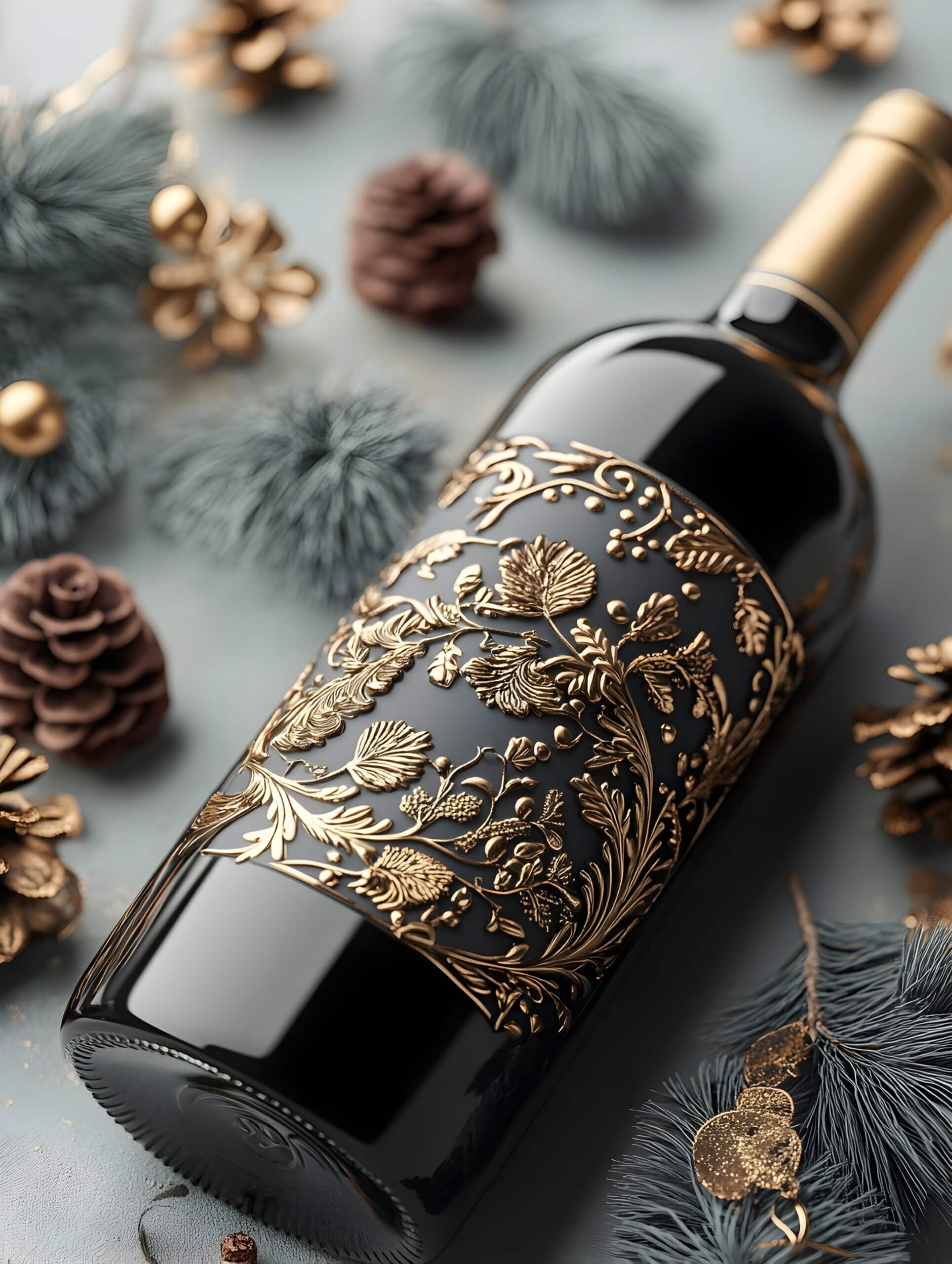
Unique Illustrations
If you’re itching for something truly different, consider incorporating some actual art into your label. There is no right or wrong way to add art to your label design, but we expect to see custom illustration crop up on labels for products in industries as varied as beer to supplements to personal care. Remember to think about who your customers are when using art in your design—including graphics in the style of Pop Art from the 1950s is not likely to resonate with young people from Generation Z as much as it will with Baby Boomers. But don’t underestimate the power of unique art to tell your story.
The most important factor when it comes to label design is, of course, your brand identity. Inovar Packaging Group is dedicated to understanding our clients’ individual needs when it comes to labels and packaging, and we will work with you closely to ensure that, whatever your design, the labels you receive from us will exceed all your functional and design expectations. Contact us now and we’ll get your next high-impact label and packaging project started.
THE LATEST FROM INOVAR
WE'RE HERE TO SERVE YOU
Creating and producing labels can be overwhelming, but our experts are here to guide you every step of the way. Whether you have a project ready to go, have questions about label applications or materials, or want to learn more about our services, our team is ready to assist you.